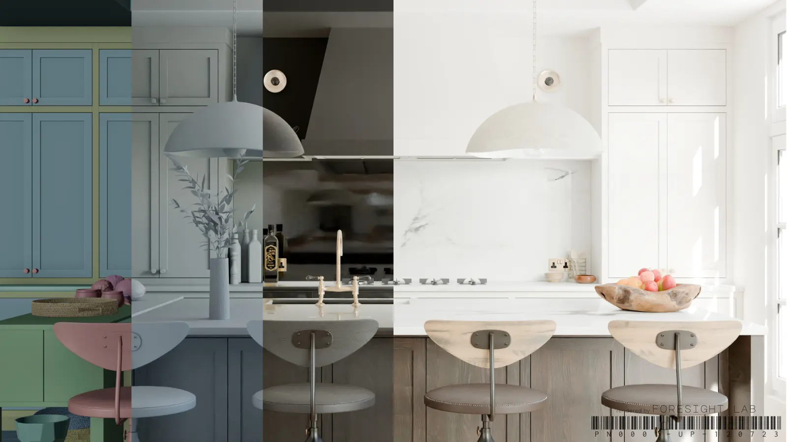
We have run a few thousand of these. The revision rounds that hurt are almost never about skill — they are about something that was assumed instead of decided, and then resolved by the wrong person.
A render is a compression of hundreds of small decisions. If you do not make them, someone else will, and they will make them plausibly rather than correctly.
The short answer
Painful revision rounds are almost never about skill — they are about something assumed rather than decided, then settled by the wrong person. A render compresses hundreds of small decisions, and if you do not make them the visualiser will, plausibly rather than correctly. The six that cost the most time, roughly in order: an unspecified finish (“oak” is not a specification — send the code), camera height, time of day, lighting intent rather than fittings, missing dimensions, and what the image is actually for — planning approval, an investor deck and Instagram are three different images. Decide those six and most rounds disappear.
What actually causes revisions
Six things, in roughly the order they cost time.
An unspecified finish. "Oak" is not a specification. There are a hundred oaks and they photograph differently. Send the code.
Camera height. Nobody mentions it, everybody has an opinion once they see it. Eye level reads as a person standing; slightly lower reads as an interiors magazine. Decide before, not after.
Time of day. A room at 11am and the same room at dusk are different products. Choosing late means relighting, which is most of the work.
Lighting intent. Not the fittings — the feeling. Bright and even, or pooled and warm? The fittings can be identical and the result unrecognisable.
Missing dimensions. A ceiling height guessed wrong throws every proportion in the frame, and it is not visible as an error until the client says something feels off.
What the image is for. A render for planning approval, a render for an investor deck, and a render for Instagram are three different images. Say which.
What to send
Drawings. Plans and elevations with real dimensions, including ceiling heights. A PDF is fine; CAD is better because it removes tracing error.
Finishes with codes. Manufacturer, product, finish reference. If a finish is not decided, say so and say what to assume — an explicit assumption is recoverable, a silent one is not.
References, sorted by purpose. Label them. "Mood" images set atmosphere; "lighting" images set the time of day and quality of light; "material" images show a specific surface. Twenty unlabelled pictures is not a brief, it is a mood.
Camera notes. Mark the positions on a plan with arrows. Thirty seconds of drawing prevents a full round.
The deadline and what it is for. Both, always.
The things worth deciding before you send
Some decisions are cheap now and expensive later, purely because of where they sit in the pipeline.
Aspect ratio. Changing from landscape to portrait after the camera is set means recomposing the shot. Decide with the end use in mind.
Styling level. Empty and architectural, or lived-in with books and a coffee cup? The second takes longer and reads warmer. Neither is wrong; choosing late is.
Whether people appear. Adding figures after the fact changes scale reading and often the lighting.
How many views. Three views of one room cost far less than one view each of three rooms, because the scene is built once. If budget matters, this is the lever.
Camera notes, written properly
Camera is the note people leave out and then spend a round fixing. It takes one line per view, and the vocabulary is simple once somebody writes it down.
- Height. 1500–1600 mm reads as a person standing. 1100–1200 mm reads as an interiors magazine, because that is roughly seated eye level and it flatters furniture. Say the number.
- Lens. 24 mm shows the whole room and distorts the corners; 35 mm is the honest default for interiors; 50 mm and above is for a detail or a vignette. If you would rather not talk in millimetres, say “wide enough to see both the island and the window” and let them choose.
- What it must include. Name the two or three things that have to be in frame. This is the single most useful sentence in a brief.
- Verticals. Say whether you want them straight. Corrected verticals read as architecture; uncorrected read as a photograph taken by a person.
- Orientation and format. Landscape for presentations, portrait for social, and say if you need both — reframing after the fact is a re-render, not a crop.
Five lines, and you have removed the most common cause of a second round.
How to give feedback
The single most useful habit: mark up the image. A screenshot with three arrows and three sentences resolves faster than four paragraphs of prose, because it removes the step where someone has to work out which part of the frame you mean.
Batch it. One consolidated round beats five trickled notes, and not for our convenience — every partial round means reopening the scene, and things that were right can drift.
And separate the two kinds of note. "The sofa should be the other fabric" is a specification change. "It feels cold" is a direction change. The first is ten minutes; the second may be a relight. Saying which you mean lets the studio tell you the cost before doing it.
What a good brief buys you
Fewer rounds, obviously. But the real return is that the first image comes back close enough to judge properly — and a first render you can judge is worth more than a third render you have talked yourself into.
Most designers we work with settle into a one-page format after a project or two: drawings attached, finishes listed, three references labelled, cameras marked, purpose stated. It takes twenty minutes and it is the difference between two rounds and five.